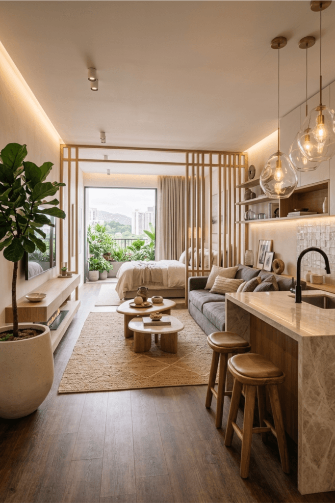
Ever cleaned your apartment… and it still feels messy?
Nothing is actually out of place. Yet something feels off.
Most people measure clutter in objects. Professionals measure it in eye fatigue.
That’s visual noise.
Too many competing elements. No structure. No clear resting points.
A small apartment doesn’t feel overwhelming because of its size — it feels overwhelming when everything fights for attention at once.
These 10 design pillars are not about adding more. They’re about removing friction from how your space is seen and used.
I. Structure & Height
1. Use Vertical Space (You’re Not Going High Enough)
The mistake:
Everything stays low → walls feel empty → the room feels compressed.
The fix:
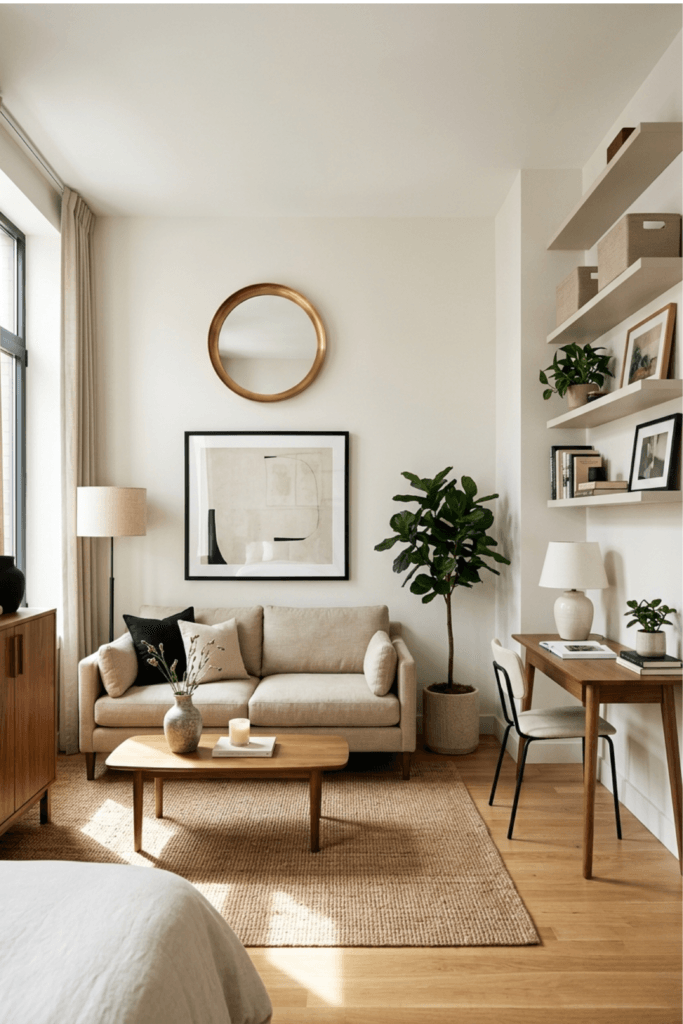
- Tall shelving instead of wide furniture
- Floating shelves above eye level
- Curtains hung close to the ceiling
Pro Tip:
Extend curtains 6–8 inches beyond the window frame on each side. This visually widens the window.
2. Layer Heights (The 3-Level Rule)
The mistake:
Everything sits at the same height → flat, cluttered feeling.
The fix:
- High: mirrors, art, tall plants
- Mid: tables, lamps
- Low: baskets, decor
Why it works:
Layered heights create visual rhythm and balance.
II. Defining the Space
3. Create Zones (Even in One Room)
The mistake:
Sleeping, working, relaxing all blend together visually.
The fix:
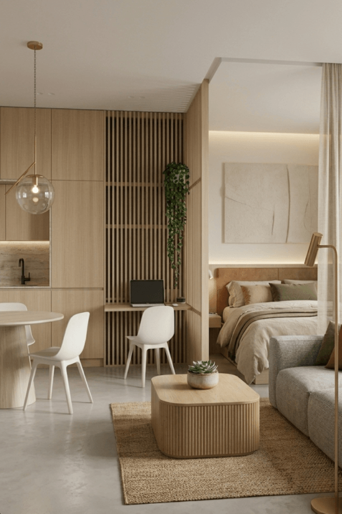
- Rug = living zone
- Desk facing a wall = work zone
- Console table behind sofa = separation
Pro Tip:
If everything looks the same, your brain processes it as noise.
4. One Focal Point Per Area
The mistake:
No focal point — or too many competing ones.
The fix:
- Living area → large mirror or artwork
- Bedroom → bed + headboard wall
- Entryway → mirror + console
Rule:
Your eye needs a place to land.
III. Visual Clarity
5. Fewer, Bigger Pieces (Visual Weight)
The mistake:
Too many small pieces → fragmented, cluttered feel.
The fix:
- 1 large sofa instead of multiple chairs
- 1 statement artwork instead of several small frames
What is visual weight?
Small elements scatter attention. Larger pieces anchor the space.
Pro Tip:
Choose furniture with visible legs. Seeing the floor underneath increases the sense of space.
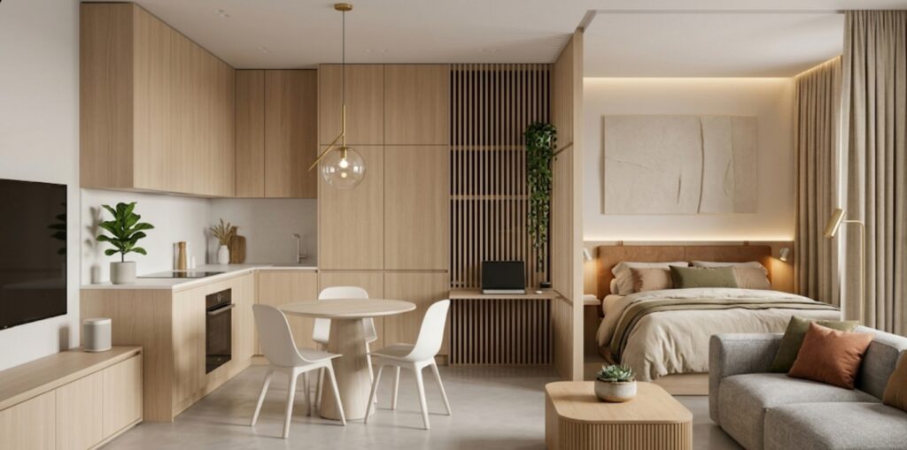
6. Hide Visual Noise
The mistake:
Everything is visible → constant visual stimulation.
The fix:
- Baskets
- Closed storage units
- Storage ottomans
Not everything needs to be seen.
7. Use Light & Reflection
The mistake:
Single overhead light + dark corners.
The fix:
- One soft light source per zone
- Mirrors placed to reflect light, not blank walls
Why it works:
Light creates depth → depth makes spaces feel larger.
8. Keep a Consistent Color Direction
The mistake:
Too many colors competing → visual overload.
The fix:
- 2–3 main tones
- 1 dominant neutral
- 1 accent tone (wood, black, muted color)
Result:
A cohesive, high-end feel.
9. The Power of Negative Space
Negative space isn’t wasted space—it’s the breathing room that allows your design to shine.
The mistake:
Treating every empty surface as something that needs to be filled.
The fix:
Respect visual “rest zones”.
- A shelf at 70% fullness feels curated
- A shelf at 100% fullness feels cluttered
What it means:
Empty space is where the eye resets.
10. Think in Systems, Not Decor
The mistake:
“What should I add next?”
The fix:
“How should this space function daily?”
- Entryway → drop zone system
- Workspace → focus + minimal distractions
- Living area → comfort + lighting
If the system works, the design follows.
Quick Checklist (Save This)
- ⬜ Do I use vertical wall space?
- ⬜ Are areas visually separated?
- ⬜ Is there one focal point per zone?
- ⬜ Am I using fewer, larger pieces?
- ⬜ Can I see the floor under furniture?
- ⬜ Is clutter hidden?
- ⬜ Do I have multiple light sources?
- ⬜ Are my colors consistent?
- ⬜ Is there negative (empty) space?
- ⬜ Does each area have a clear function?
You don’t need more space.
You need less visual conflict.